

 1300 353 700
 info@magiknewmedia.com.au


Determining your corporate identity: the psychology behind your logo
Ask an entrepreneur about the core values of his company and you will often receive a very specific answer. They have thought long and hard about this and incorporated a certain vision of the world or a particular goal. In fact, every business has a corporate identity.
However, this identity is not always depicted in the graphics-based representation of a company, otherwise known as the logo or house-style. Why do many entrepreneurs skip such an important opportunity?
The Greek word ‘logos’ literally means ‘word’. When it comes to a logo, it makes sense to think of the one word or phrase that perfectly depicts your core values and turn this into a visual. A logo.
What does your logo say about how professional your company is? How do you put across your house-style to a potential customer? These are actually very complicated questions, as behind every popular design is a well-thought-out psychology.
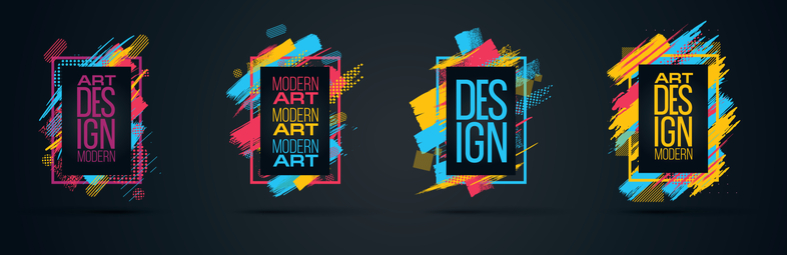
The first thing a graphic designer learns is that a logo must be simple. Never use two lines when you can use one. Never add a third colour when two is enough. There is an important reason for this advice. For those who have not yet heard of your business, every part of your logo will reflect who you are and what you do. The logo – usually unconsciously – depicts the underlying corporate identity. As a business owner, you should be aware of this. The more time you spend perfecting your logo, the more you can make sure that logo reflects your corporate identity.
![]()
What’s in a colour?
Different characteristics have traditionally been associated with different colours. Think about how the colour red is used to represent passion, energy or romance. You won’t find ladies of the night waiting for clients in the White Light District when white stands for purity, clarity, and innocence. Orange has become a symbol of innovation, creativity, and thinking, while black gives the impression of strength, solidity or death. Blue evokes feelings of self-confidence and integrity, and green implies an environmentally friendly attitude, peace, and calm. It is only logical to include the idea behind a colour into logo design. Nevertheless, this aspect is often ignored. On the other end of the spectrum, the psychology of colour is sometimes taken to the extreme. The logo for your innovative, energetic, honest and environmentally company could look like a chaotic mess, let alone become expensive when producing printed media. Choose one or two colours and stick to them.
Shape recognition
In addition to colour, a form also plays a crucial role in determining corporate identity. The iconic M of McDonald’s, the simple ‘F’ of Facebook, and a half-eaten Apple are all good examples. These big brand logo shapes were not created by accident. Just as with colour, shapes also tend to represent feelings or actions. Think of the Nike swoosh, for example. Straight lines are linked to power, professionalism, and efficiency, while circles and more rounded shapes seem to relate to community and unity. Vertical lines are aggressive in comparison with horizontal lines. Often, a handwritten font will appeal more to females.

Using a professional logo designer
It is rare that a great logo is created by an amateur. The Walt Disney signature has become a globally recognised image not because it is particularly clever, but because years of seeing it on our screen have etched it into the minds of young and old alike. It was used before Walt Disney became a household name. The addition of the castle to the logo, however, was thought up by the designer. Most of us don’t have 75 years to make our logo a universal image. And many startups have enough on their plates and are unable to put in the time and extensive effort to create a professional logo which says exactly what it should.
Although there are many logo design apps on the market, it’s well worth hiring a professional. You need only to think about the difference between a professionally designed garden on interior compared to the home and garden of someone who has no idea about proportion, colour and making a statement to realise that a truly professional creative product is usually created by a truly professional creative mind.
![]()


