1300 353 700
 info@magiknewmedia.com.au


If you had to look the word in the title of this article up, there’s a good chance your website design doesn’t take protanomaly, protanopia, deuteranomaly, deuteranopia, tritanomaly, tritanopia and monochromacy into account. However, these are important when contemplating your colour palette. In fact, you may be alienating approximately one in ten male and one in two hundred female online visitors by not catering for this group. For a small site with little traffic, this may not be enough of a reason to change a company logo or re-envision an expensive landing page. For others, it’s worth making a few changes to increase website accessibility to as many visitors as possible.
Naturally, we are talking about colour-blindness.
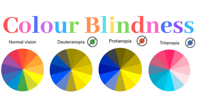
Colour-blindness in a nutshell
Normal sight requires our brains to process three types of light – blue, green and red. To perceive the different frequencies of light (and therefore colour), special light receptors at the back of the eye known as cones are necessary. Humans have three different types of cone (photoreceptor) which pick up different lengths of light wave. A fault in one or more cone group will lead to ‘anomalous trichromacy’ – an anomaly in the perception of one or more of these three colours – protanomaly, deuteranomaly, and tritanomaly. The complete absence or breakdown of one or more types of the cone will mean it becomes impossible to perceive the wavelength that cone represents, leading to protanopia, deuteranopia, tritanopia, and monochromacy.
It is possible to be slightly colour-blind or totally colour-blind. One can be partially colour-blind to a single shade, or confuse every colour but black and white and heavily contrasting greys. The majority of colour-blind people have trouble distinguishing between red and green, or confuse shades that are sufficiently contrasting for those with normal colour perception.
Anti-Protan and Anti-Protanope Web Design
When the cone that is receptive to red light does not function as it should, the eye (read: brain) is less responsive to shades that incorporate this colour. Instead of short wavelengths lengthening from blue to green to red, ‘protans’ will see blue turn to grey and then to a mustardy shade of yellow.
If your logo or website incorporates the following pairings it is time to improve the UX of your protanope public:
1. Lots of black with various shades of red
2. Dark brown paired with dark green, dark orange and dark red
3. Various reds, purples and dark pinks
4. Mid-green paired with mid-orange
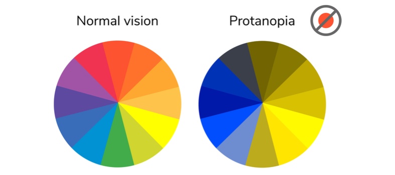
For the above pairings, a protanope is very likely to confuse these colours with each other. There will be very little contrast between them.
Anti-Deutan and Anti-Deuteranope Web Design
Probably the group with the largest number of ‘no-no’s’ when it comes to the designer’s colour palette, ‘deutan’ colour-blindness represents a fault in the cone that detects wavelengths close to that of green light, making it more likely to translate a light source as coming from a red wavelength.
When designing for deutans, avoid the following combinations on a single page or section.
1. Mid-red with mid-green
2. Blue-green with grey
3. Blue-green with mid-pink
4. Bright green with yellow
5. Pale pink with light grey
6. Mid-red with mid-brown
7. Light blue with lilac
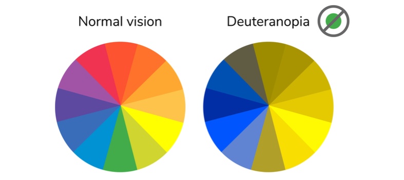
The above pairings will provide insufficient contrast for a deutan or deuteranope. If your new logo is composed of these shades, it might be worth reconsidering the design before your brand is launched.
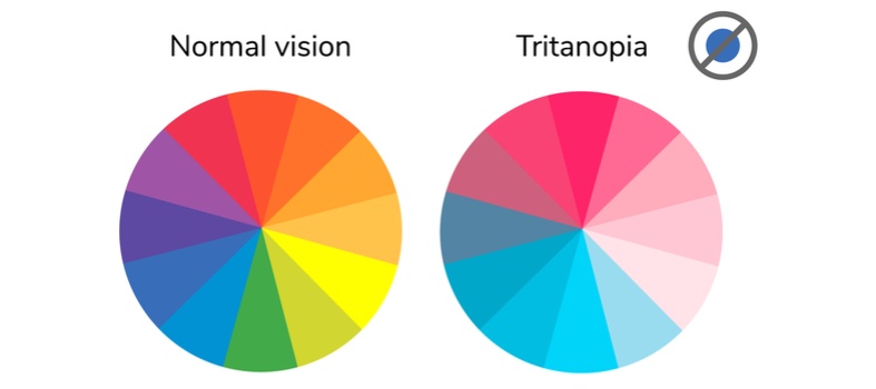
Anti- Tritan and Anti-Tritanope Web Design
With reduced shortwave perception and the subsequent inability to perceive blue light in the same way as people with normally functioning cones, ‘tritans’ are quite rare. Most website designers do not take tritanopia into account for this reason. The most common colour confusions for tritanopes are light blue with grey, dark purple with black, mid-green with blue, and orange with red.
Complete colour-blindness – Should I create a monochrome website?
The answer to this is no. Not unless you think a monochrome website is what is right for your product, service or blog. Cone monochromacy means there is very little distinction between colours and the world is seen in shades of grey. This type of colour-blindness is what should guide web designers in terms of contrast, not of colour.

Best Use of Colour and Design for Colour-blind Website Visitors
Web design for colour-blind audiences doesn’t mean much of a compromise. As with the best website designs, simplicity is paramount however perfect or imperfect your visitor’s eyesight. If your brand is already recognised, there is little point in making changes as even the colour-blind public will have learned to associate your brand with your product through shape and wording, and perhaps even thanks to the various shades of mustard it causes them to see.
However, for startups or the most recognised names, it is worth using the following tips to improve user experience for the colour-blind population. Yet the advice below is useful in more than a single scenario, and is often applicable right across the broad board of digital design.
1. Keep it simple. The fewer the colours, the better.
2. If you haven’t already got a successful one, create a visual logo that uses both colour and form and has an obvious association with your company sector or mission
3. When using colours (map areas, graphs), use effects such as chequerboard, stripes, diagonals and dots in addition to variations in colours. Red with dots, blue with stripes, etcetera.
4. Use sites such as TopTal or Color Oracle to check how your current site appears to the different colour-blind types.
5. Don’t overlay text on complicated imagery, or at least reduce the opacity of the underlying image.
6. Pay attention to the colour of your hyperlinks in combination with the background colour of the page and the font colour – this is often forgotten.
7. Implement universal colour-blind-friendly colours – these will make little difference to monochrome vision, but red-green and blue-yellow anomalies will see the difference, literally.
8. Pay attention to your forms and signup areas. If your visitor can’t easily read the form, he or she is much less likely to try to fill it in.
9. When selling items available in various colours or advertising these products, a colour-only selection tool is insufficient. Add the written name of the colour as a label. This should apply to all colour coding, including ‘red alert’ messaging. Always accompany colour with an explanation of what that colour is, or make it otherwise recognisable.
10. Keep button and action colours the same throughout the site, keeping them quickly and easily recognisable throughout any multi-page website.
11. Integrate larger fonts to increase contrast.
12. In general, avoid the following colour combinations on a single page or section of a page:
a. Green and:
i. Red
ii. Brown
iii. Blue
iv. Grey
v. Black
b. Light green and:
i. Yellow
c. Blue and:
i. Purple
ii. Grey
The More the Merrier
Alienating any group through unconscious design is an unforgivable sin. Online accessibility may not be considered an essential concept in web design, but it is a concept that shows that your business pays attention to its audience. Adding online accessibility tools for the deaf, the blind, those with speech impediments and the colour-blind is the correct step for any business which makes a conscious effort to put its public first.