It’s relatively rare to find a shining example of a great homepage. The reason for this is because not everyone knows the true goal of the homepage. It’s not a sales page. It’s not a portfolio. It’s not a summary of your service or a contact page, either, unless you have a single-page site. It’s a tiny mix of these combined with an immediate visual of who you are and what you can offer.
The Goal of the Homepage
Your homepage is constructed for new visitors, giving them a rapid idea of what they can expect from you. Those who already know you, and use your services, have seen it before and don’t hang around. They just click on the menu.
When it comes to new users, you need to know what they want to see. Chances are they will have arrived at your page through a search engine referral. This means they have used your keywords to find you. Let’s imagine you supply hand-made sofa beds. If you have been clever with your SEO, the visitor will have found you quickly after typing in a number of search terms including hand-made, sofa bed, and perhaps the locality. This means the new visitor knows you supply sofa beds. He or she probably also knows which regions you supply sofa beds to, or at least in which country you are situated. So the goal of your homepage isn’t to convince others that you supply sofa beds. It’s to convince them that you are the best supplier. It’s to put your website on top of their short list, because that visitor will have looked at your competitor’s homepages, too.
What your new visitor wants to know
You visitor, let’s call him Bob, has decided he needs a sofa bed in his apartment but wants an original style. The fact that he’s put ‘hand-made’ in the search engine also says that he’s willing to pay more, and wants great quality. It’s up to your homepage to let him know that you offer him a wide enough choice of high-quality, hand-made sofa beds. He might or might not want a matching armchair. If you can convince him to purchase both, all the better. And as he’s looking for quality design, your homepage needs to tell him this. In short, your homepage needs to tell Bob:
1. That you offer him a choice in what he’s looking for
2. That you offer him other accessories that suit what he’s looking for
3. That you have the same sense of style as him
Bob has arrived at your site and is willing to give you a few short seconds of his time before either choosing another site or looking deeper into yours. It is this first impression that counts on your homepage, nothing more.
Finding an example of a great homepage isn’t as easy as you may think. Big brands don’t need to spend too much time or energy on their homepage, as they are already well known. The visitor knows what to expect without looking at it. A decision doesn’t need to be made based on the homepage. So for big brands, the homepage is a different entity: sales. Startups and smaller companies need to approach their homepage as a first impression, not as a list of products. And if your homepage doesn’t inspire curiosity within seconds, you may have lost a customer.
Size is everything
Not every visitor will scroll down through a homepage. In fact, not many of them bother if their initial requirements are not met at first glance. It is that first, screen-sized section that needs to be the most persuasive. This requires proper use of space, correct sized font, and a menu bar which doesn’t take up too much of this space. This small, oblong section should not be busy. Your users screen size will also have to be considered, making responsive web design obligatory for high-quality homepages and websites. Your homepage must be the result of much consideration and discussion with those who know exactly what they are doing.
Limit your content
Many website designers have found a solution to the lack of ‘first impression’ space by including carousal banners. This means Bob doesn’t have to scroll down the page or click on the menu – at least, not immediately. It also means he can view this section of the homepage while unobtrusively receiving additional information. In the sofa bed example, this might feature a carousel showing the story of this company’s hand-crafted furniture, showing in-house images of the craftsman producing one or two final products – a sofa bed and a matching armchair. Another mistake is to over-generalize, offering ‘everything you need’, being ‘a one-stop shop’, in fact, the word ‘all’ should not be in your homepage at ‘all’. The use of clichéd phrases is an additional no-no.
Reams of text on a homepage are the equivalent of professional suicide; however, there does need to be sufficient explanation of:
1. What products you offer
2. What makes you different
This should be worded simply and effectively, using font size, font colour, and text placement to support the value of these carefully chosen words. Text should be easily read; placing a capital letter in every word of the heading, for example, can be distracting and off-putting. Eye-tracking does follow a certain pattern, but a good web designer is able to manipulate this feature which is certainly not a fixed and predictable behaviour.
Stylised, customised imagery
The photographs or videos you use on your homepage need to have been properly thought out, preferably with professional help. Your audience knows what a stock photograph looks like. But they probably don’t know your logo. A combination of a relatable image to your logo is therefore important. If you supply hand-crafter living room furniture and your logo features a star, you will either have to rethink the logo or incorporate a picture of a skilfully made piece of furniture that somehow features stars of a similar shape to your logo. This is because your homepage is not about promoting your brand, but showing that you offer what the visitor is looking for and more, and telling them what makes you different to other furniture makers.
Monochrome or basic colour palette
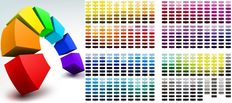
If your logo has multiple colours, there is no reason why you should incorporate all of them on your homepage. Use the same principle as the decoration of a small room in a house: simple, monochrome, one or two large features instead of multiple small items to detract the line of view. This also applies to fonts and general styling. Multiple banners, bars, and boxes are for showing your existing customers their choices, not for creating an initial impression of professionalism. One or two main features, the correct form, and size of the font, and a simplistic colour scheme will do this. Bright lights, flashes, and bangs will not.
Are you too good to be true?
Website visitors are already searching for the negative. Although at their first viewing of your homepage they are not yet ready to search the small print, alarm bells will ring if you seem to offer something that’s bigger, better, cleverer, cooler, is free to deliver and is also much cheaper than anyone else. This might have the opposite effect, making your visitor search multiple other similar sites seeing if you really are the less expensive supplier. In Bob’s situation, he’s not necessarily looking for cheap. If he did, he wouldn’t be looking for hand-crafted furniture. He would probably be more interested in his choices of upholstery fabrics, the options for customisation, the time needed to make this. But all this comes as secondary, once he has been convinced to look through the site. Expansive promises create a feeling of doubt. Not only can a business not supply ‘all’ to ‘all’ (as we have already mentioned), most buyers realise that businesses have to make their profits somewhere.
Flount your specialism
Already touched upon when talking about not being able to supply everything to everyone, your homepage should feature your specialism. While in the example used here, furniture is a broad subject, this company might advertise its speciality as hand-made living area furnishings and selected matching design accessories. The term ‘home furnishings’ has no place on their homepage, as they do not offer every item of home furnishings available.
Avoid the hard sell
A registration form has no place in the first impression. A contact form may be included further down the page, requiring further scrolling, but should never feature in the initial view. This is the equivalent of a heavy sell. Many homepage visitors now associate a contact form with the end of a website page, which is where this part should always be relegated.
Why are you different?
This is the foundation of your homepage which should be projected either using short phrases or imagery. Remember the IKEA campaign with machines thumping thousands of times on pieces of furniture? This piece of advertising worked – and still works – like a charm. Before IKEA, businesses just used the term ‘durable’ and what they promised was taken with a pinch of salt. IKEA visually proved their products’ durability. In Bob’s case, he knows that every craftsman takes pride in his work. He already understands that most hand-made pieces of furniture are constructed with a higher quality a material than mass production items. In the immediately visible space of your homepage, your job is to inform Bob of your carefully thought-out mission statement. Because your mission statement, if written correctly, should explain exactly why you differ from the competition. Long-winded explanations have no place here; if the company supports local weavers for the production of upholstery material and has taken various measures to reduce its carbon footprint that far exceed national recommendations, this needs to be put across in two, extremely short phrases.
Your Great Homepage
Your great homepage should be simple. During the initial design stages, you should not be considering what to add to it, but what to take away. The most minimalist methods are required where you can clearly answer your first-time visitor’s questions using a minimum of media:
1. Do you supply what I am looking for?
2. What else do you supply?
3. What makes you different from the rest?
Once you have taken excess information and distraction away, it is time to consider how to refine what remains, keeping in mind that your homepage’s goal is to get the first-time visitor to scroll further down the page or click the menu bar, nothing more. The homepage is not a method used to gather subscriptions or make a sale. That’s the job of the rest of your website. By understanding this, you are much better equipped to create an effective homepage for any brand which is not (yet) globally or nationally recognised.


 1300 353 700
 info@magiknewmedia.com.au


